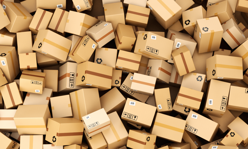
Having a clear, easy to follow checkout journey can mean the difference between a customer completing their purchase or not. With over 65% of users abandoning carts before making a purchase, it’s just as important as the presentation of your products themselves.
Believe us, there is such a thing as too much choice. Here are our top tips for decluttering your checkout to reduce cart abandonment.
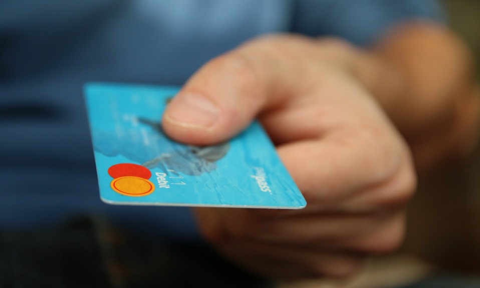
Provide one option for each payment type
Providing one payment option for each payment type makes it clear to customers which option they need to use for their chosen payment method. For most stores we suggest having one option for debit/credit card, digital wallet and instalments. Our recommendations are EKMPAY powered by ClearAccept or PayPal. This means that there’s no chance for customers to get confused so that they pay quickly and are less likely to drop off. You want the process to be so easy that they don’t stop to question any step.
It also ensures customers trust you by delivering the professional journey they are expecting. Having multiple options for debit card payments when they are used to seeing one can be confusing as they may think there is a difference that impacts them that they are unaware of, and at worst can potentially look fraudulent.
It’s also essential to make sure that your shipping/delivery costs are clear from the start of your customers’ journey on your online shop. This can be achieved with a banner promoting your delivery costs, and ensure if you have various delivery options that these are easy to select before the payment page.
Keep it quick and clean
You should aim to make the checkout and delivery fields on your website as efficient as possible. You need to strike a balance between requiring as much of the information needed for payment and delivery as possible, without presenting them with a long form or too many stages that feel never ending. It needs to be quick and digestible so that it’s easy to fill out whilst also keeping them moving through the process and reduce drop off.
Auto-address lookup tools such as Fetchify are a great way to speed up the checkout journey, with attention spans ever-limited, auto-complete features are a must to get accurate information quickly input into data fields.
Also, don’t be tempted to include any extra images or elaborate graphics on your checkout page – other than images of the products in the basket – as this can overwhelm customers and make navigating, what needs to be a very functional and operational page, difficult.
Save the best ‘til last
The checkout is key to ensure that you begin the aftercare journey for your customer and is so often overlooked as part of a sales funnel. Hooking purchasers in with brand activation, discounts for future purchases and signing up for newsletters are great ways to make sure a customer returns. However, don’t rush to achieve these goals. Requiring users to login or sign up to make a purchase can sometimes be off-putting and create another barrier to completing the purchase, it also creates more clutter at the checkout phase.
Instead, leave discount codes, further information on offers and creating accounts until the order confirmation stage of the transaction. This means a happy and satisfied customer is making decisions on whether to continue to engage with your brand and not one who is still considering the purchase.
Remember, keeping the process as streamlined as possible is key. Providing too much information or placing too much emphasis on the customer to provide lots of information will likely scare off potential purchasers, also being clear on what payment providers are available will ensure that you’re converting more sales than ever before.