EKM Brand guidelines
Our award-winning platform has earned a reputation for quality and excellence that few can rival. Our mission and positioning, as well as our brand platform, reflect that heritage.
To help maintain the strength of the EKM identity, follow these guidelines carefully when promoting EKM.
The EKM logo is the most immediate representation of our company, our people, and our brand to the world. It is a valuable corporate asset that must be used consistently in the proper, approved forms.
There are two versions of the EKM logo - 1) Logomark and 2) Logo Glyph
Logomark
This is the main EKM logomark, this is to be used wherever possible, wherever space allows and for any print or digital material.
Logoglyph
This is the EKM Logoglyph, this is to be used in areas of limited space e.g on user interface design or as a favicon.
The primary form for the EKM logo is the EKM Blue logo. When colour or printing prohibits this, it may be reversed out to white as long as the legibility and integrity of the logo are not diminished.
EKM Blue Logo
Hex Code - #026ac2
CMYK - C87 M58 Y0 K0
RGB - R2 G106 B194
Pantone - 2386 C
Inversed Logo
White is the prefferred logo colour on backgrounds other than white or cool grey.
The EKM logo needs adequate spacing for maximum legibility and impact. Please adhere to these spacing considerations, your best approximation should be fine but if in doubt contact the EKM marketing team.
X = Spacing between letters on full logomark. Note - Reduce the Glyph size by 10% when putting it inside of a circle.
For legibility in both on screen applications, and printed collateral, the EKM logo must be sized above the minimums specified, in large format material scale the red tag logo proportionally to the piece.
Web usage
To preserve legibility on screen, the EKM logo should never be used smaller than 60px wide logomark and 30px wide logoglyph
Print usage
To preserve legibility in print material, the EKM logo should never be used smaller than 1.5inch wide logomark and 0.5inch wide logoglyph
On the chance the logo must be used with type the typeface that must be used is Clear Sans Regular, see below for spacing considerations.
Please do not improperly use the EKM logo, this includes but is not limited to using poor quality versions of the logo (Full vector and high quality versions can be downloaded via the resource pack), and adding unnesscary strokes or dropshadows.
Logo colors inconsistent with brand standards. Including but not limited to wrong colours, alternating colours or unnesscary decoration or gradients.
Letters are stretched out and distorted either vertically or horizontally.
Background colors inconsistent with brand standards and or not enough contrast between background and logo colours.
Using the old logo ekmPowershop logo.
Vertically stacking the letters of the logomark.
Incorrect spacing or sizing of the logo. Including not meeting minimum size or spacing requirements.
Below are some examples of correct and incorrect usage of the EKM brand and logo in situ.
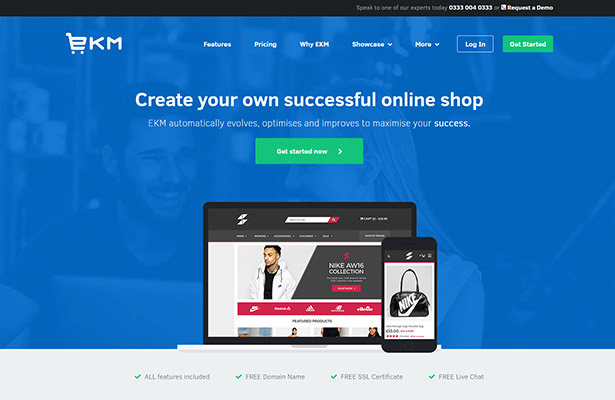
Correct usage EKM website
EKM logo on blue background on EKM homepage, reversed to white, with sufficient spacing and above minimum sizing.
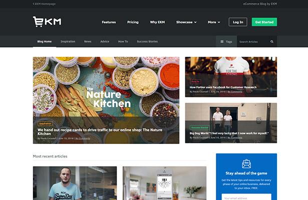
Correct usage EKM blog
EKM logo on dark grey background on EKM blog, reversed to white with sufficient spacing and above minimum sizing.
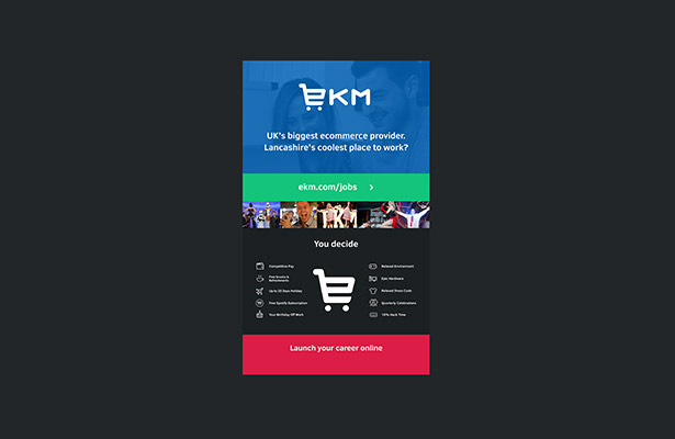
Correct usage Printed roller banner
EKM logo on blue background on EKM Careers banner, reversed to white, with sufficient spacing and scaled to be visible in large print format.

Correct usage EKM staff clothing
EKM logo in EKM blue, correctly spaced and sized within love heart on EKM blue T-shirts.
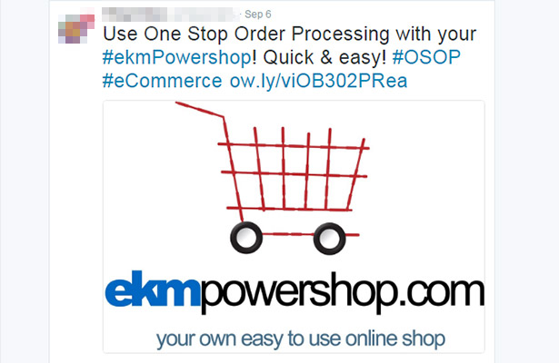
Incorrect usage Twitter mention
Using the old EKM logo, and also reffering to EKM as ekmPowershop is against the EKM brand guidelines.
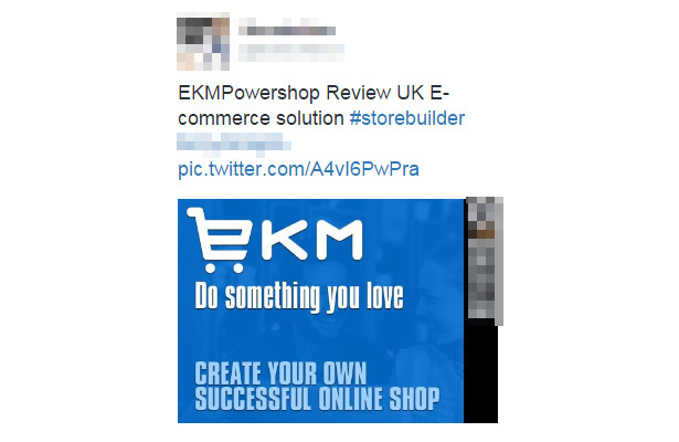
Incorrect usage Twitter banner design
EKM logo is not correctly spaced, and the according text is not in Clear Sans.
Download the EKM Brand resource pack that contains
- CMYK(for print) Vector Logomark and Logoglyph
- RGB(for screen) Vector Logomark and Logoglyph
- Clear Sans Font Family TTF/OTF and Web Fonts
- RGB Photoshop(PSD) Files of Logomark and Logoglyph
- PNG Logo’s in various sizes and colour combinations
- SVG Version of Logo - For web usage

